
Heritage Driven Skincare
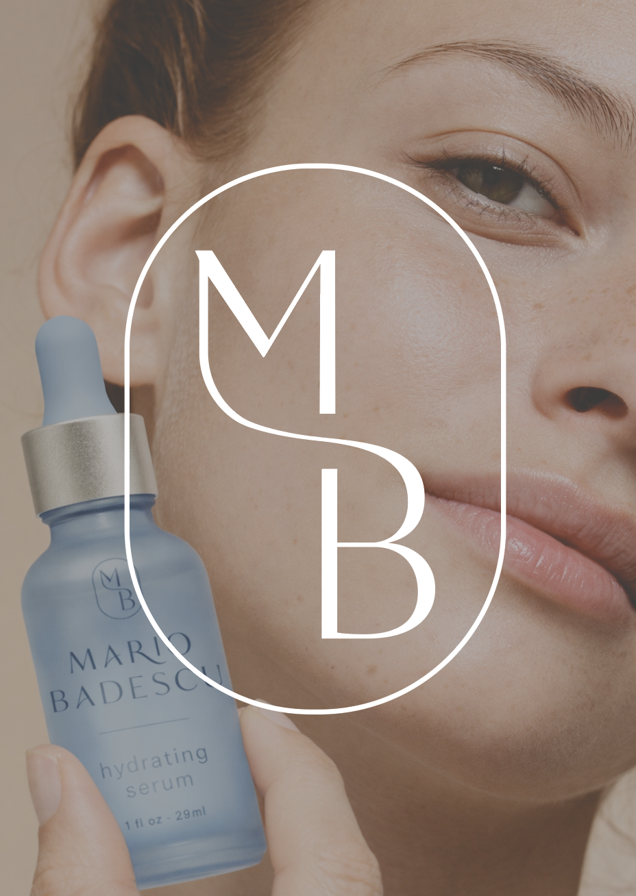
Mario Badescu
Branding | Art Direction | Packaging
A rebrand for Mario Badescu designed to elevate the brand through a refined, sophisticated visual system while honoring its heritage and European roots.
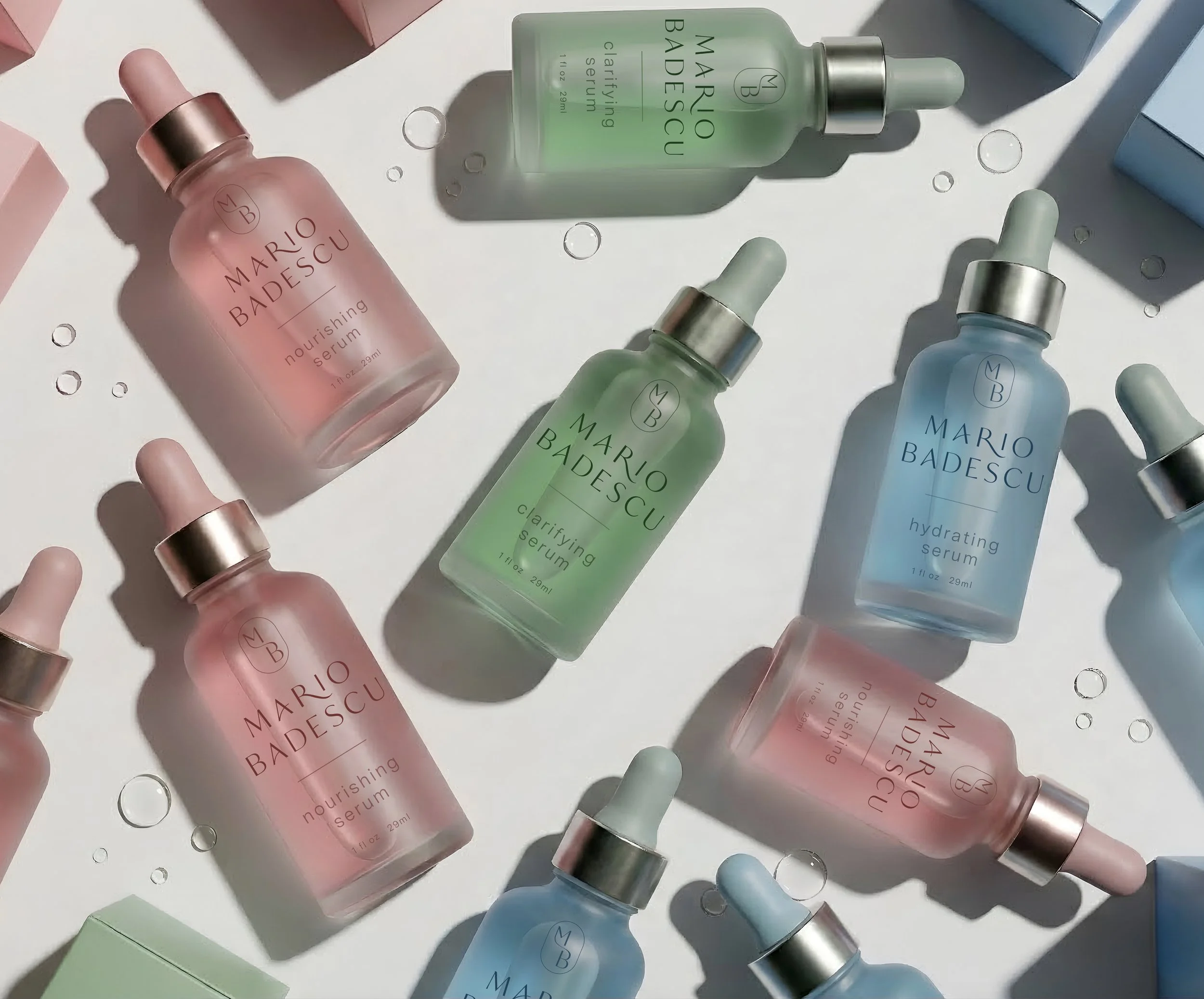
The Approach
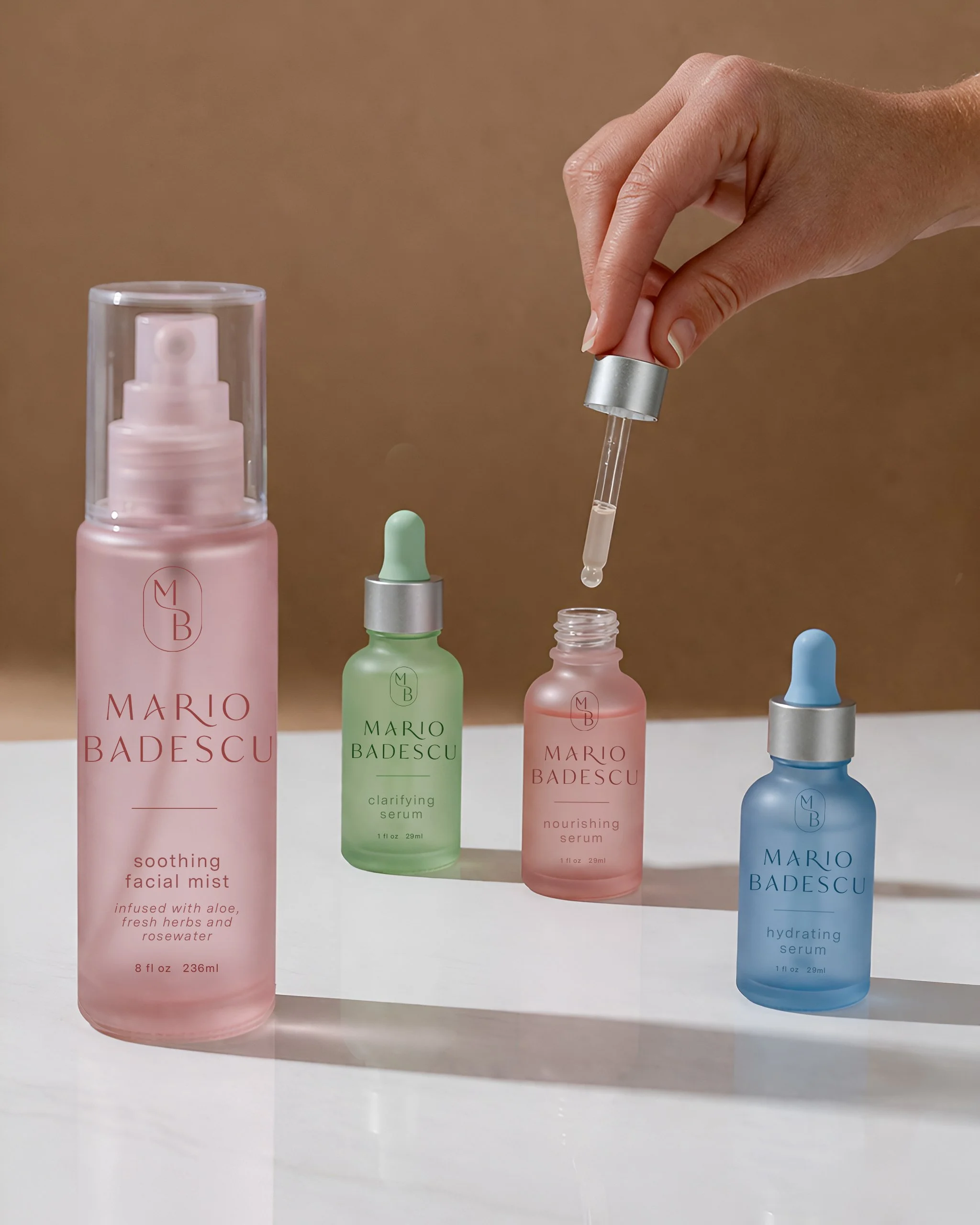
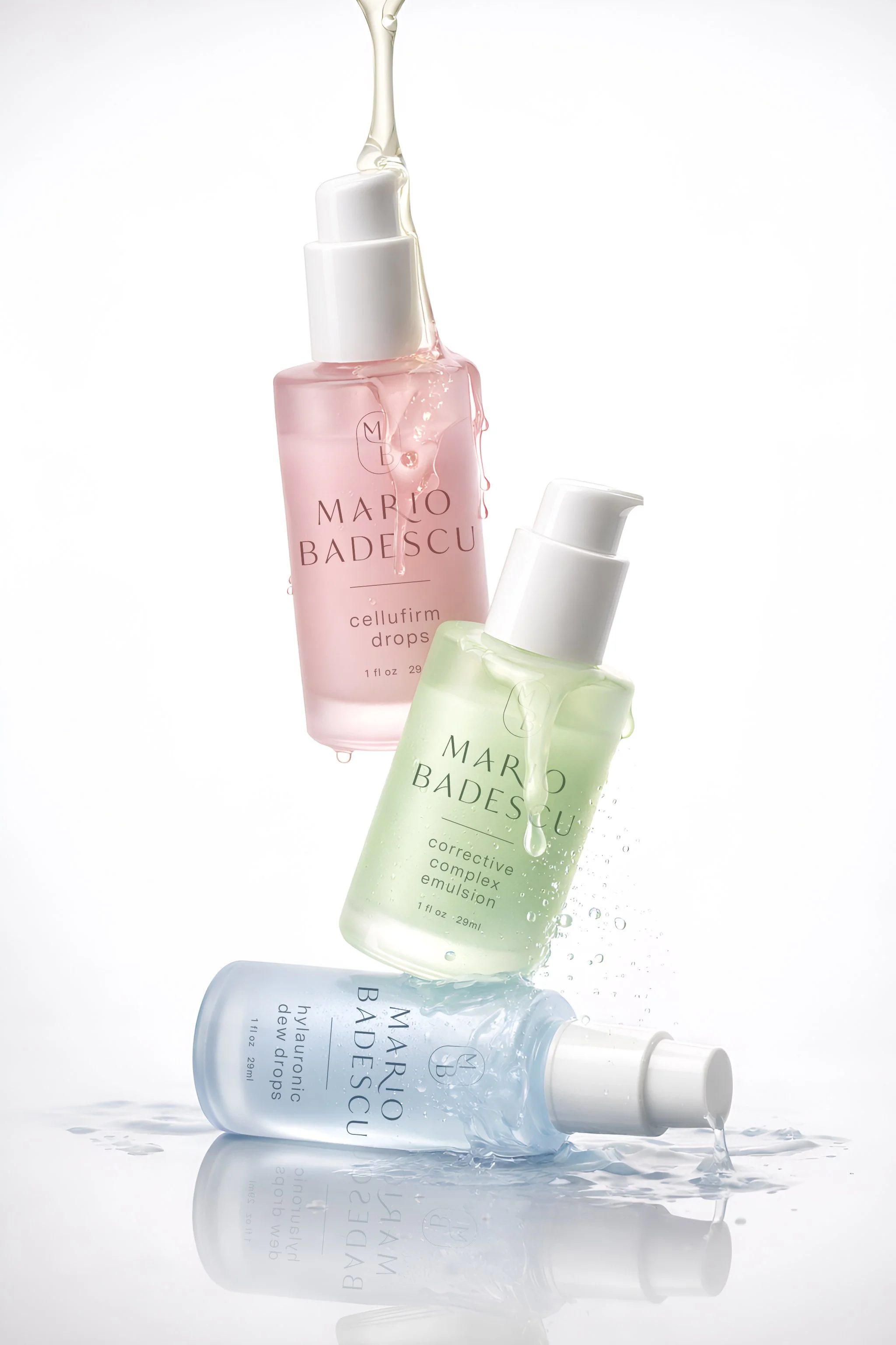
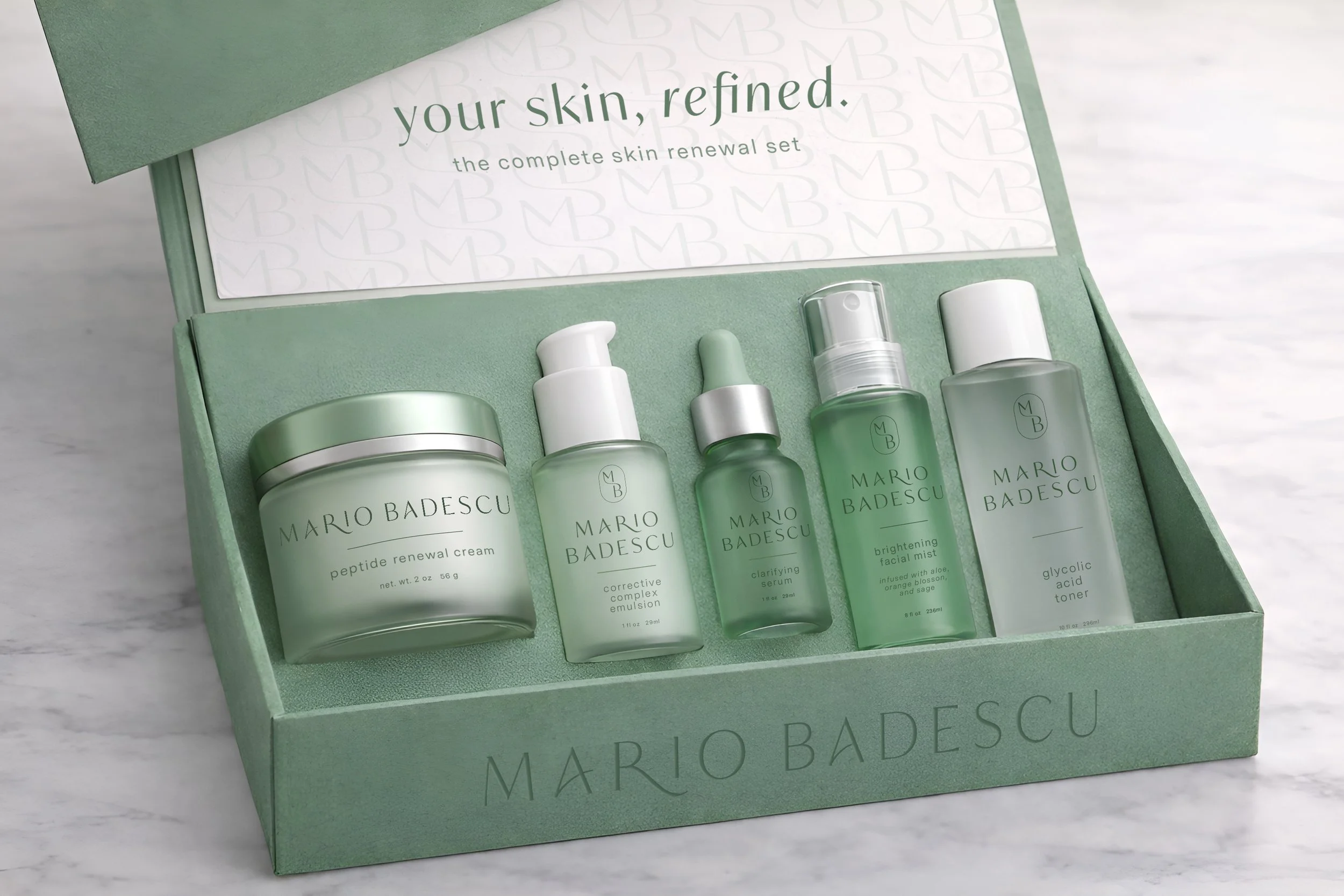
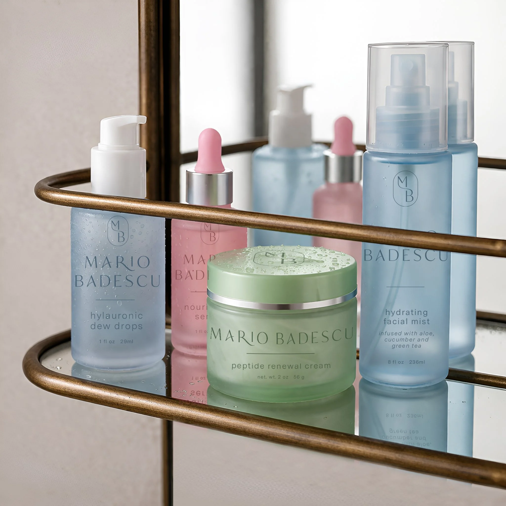
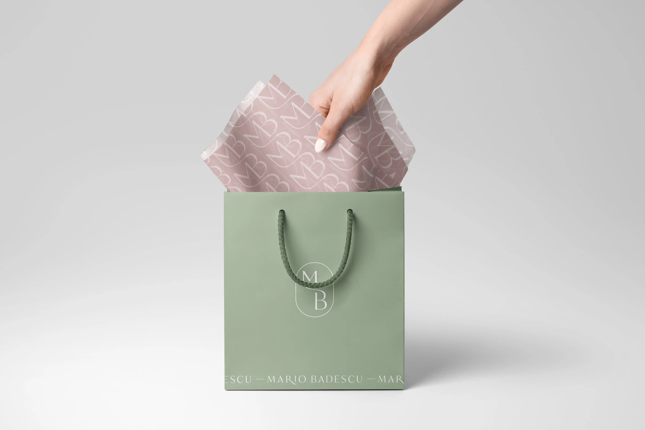
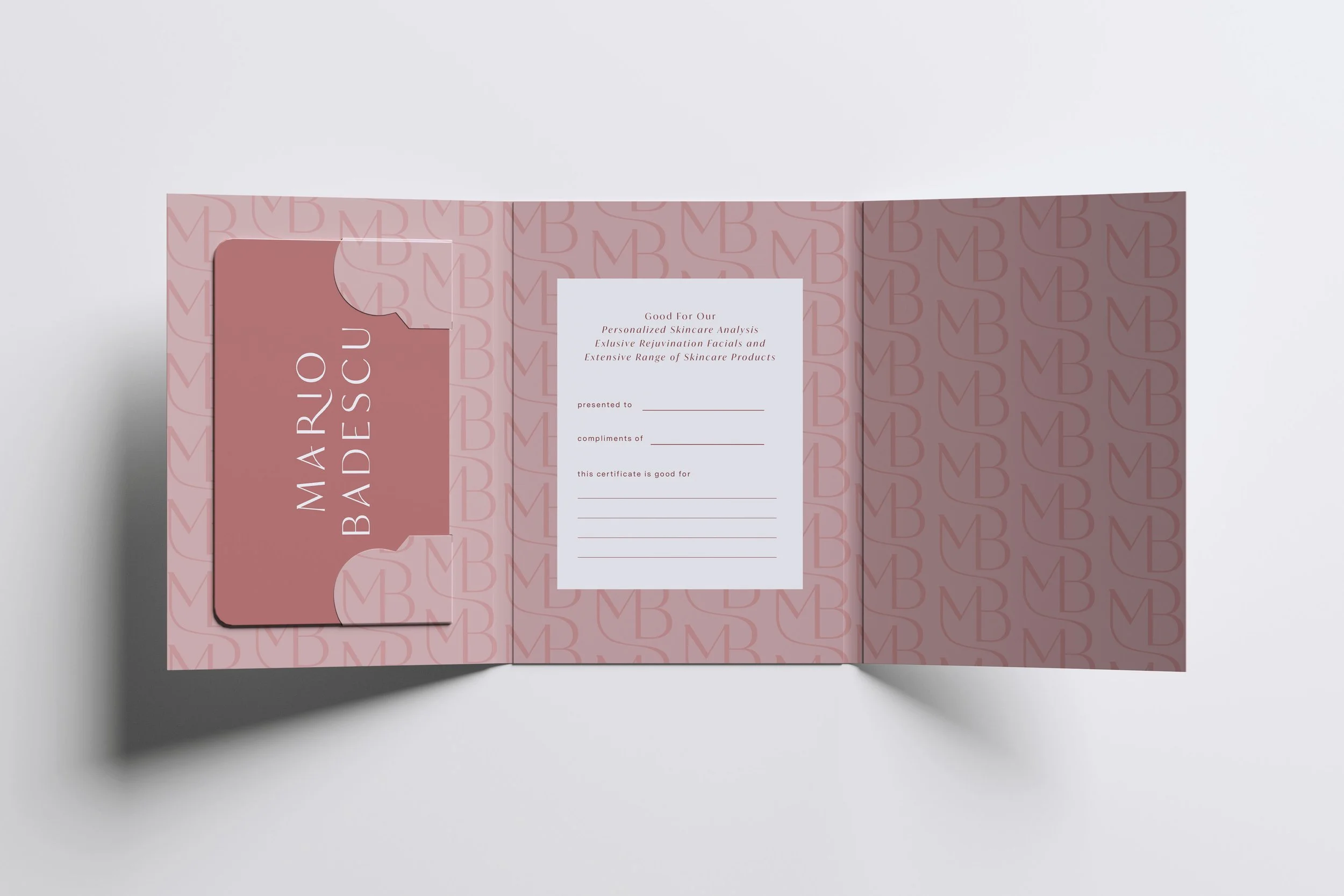
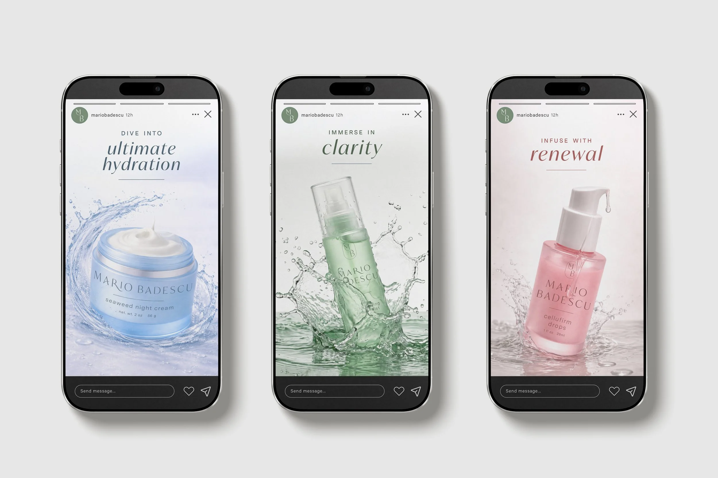
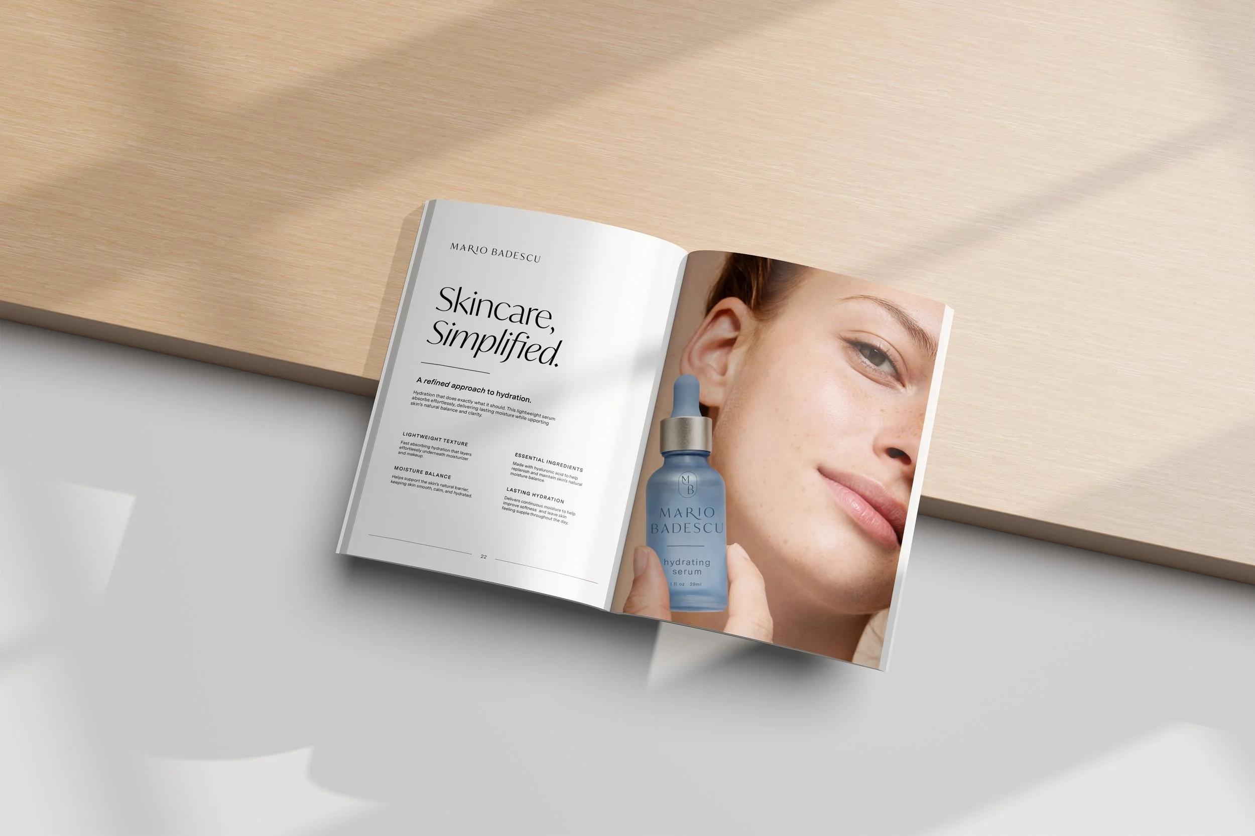
The redesign refines the logo and reimagines packaging into a more cohesive, elevated system. Minimal typography, a restrained color palette, and intentional use of negative space create clarity and balance, reflecting the brand’s ingredient-led philosophy. Soft color and editorial composition introduce a more premium feel while maintaining trust.
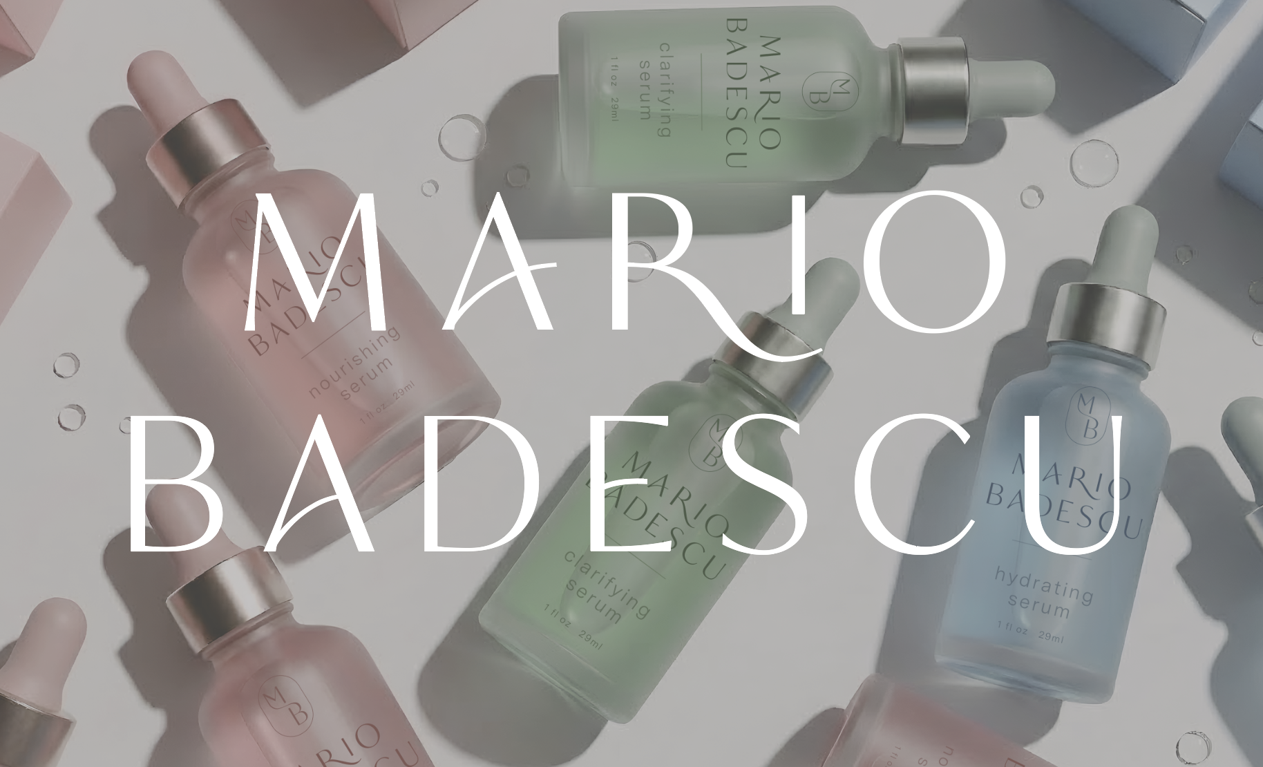

The Result
The result is a more cohesive, elevated visual system that modernizes the brand while preserving its trust and heritage.