

Handcrafted Hard Cider
ACE Cider Co.
Branding | Packaging
A rebrand for ACE Cider designed to modernize the brand while emphasizing craftsmanship.
The Challenge
The objective was to evolve the identity into a more cohesive and contemporary system while maintaining recognizable brand equity.
The Approach
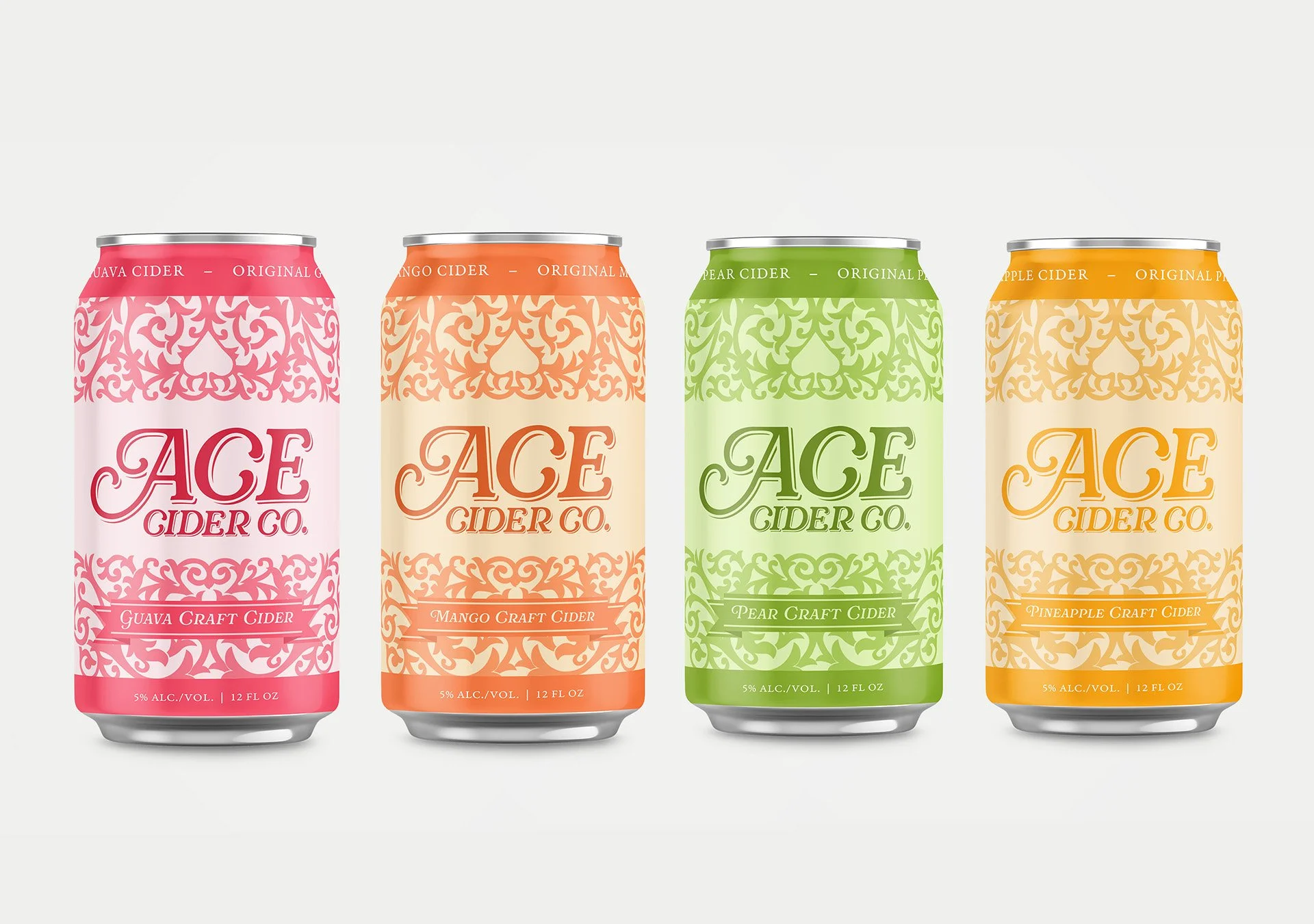
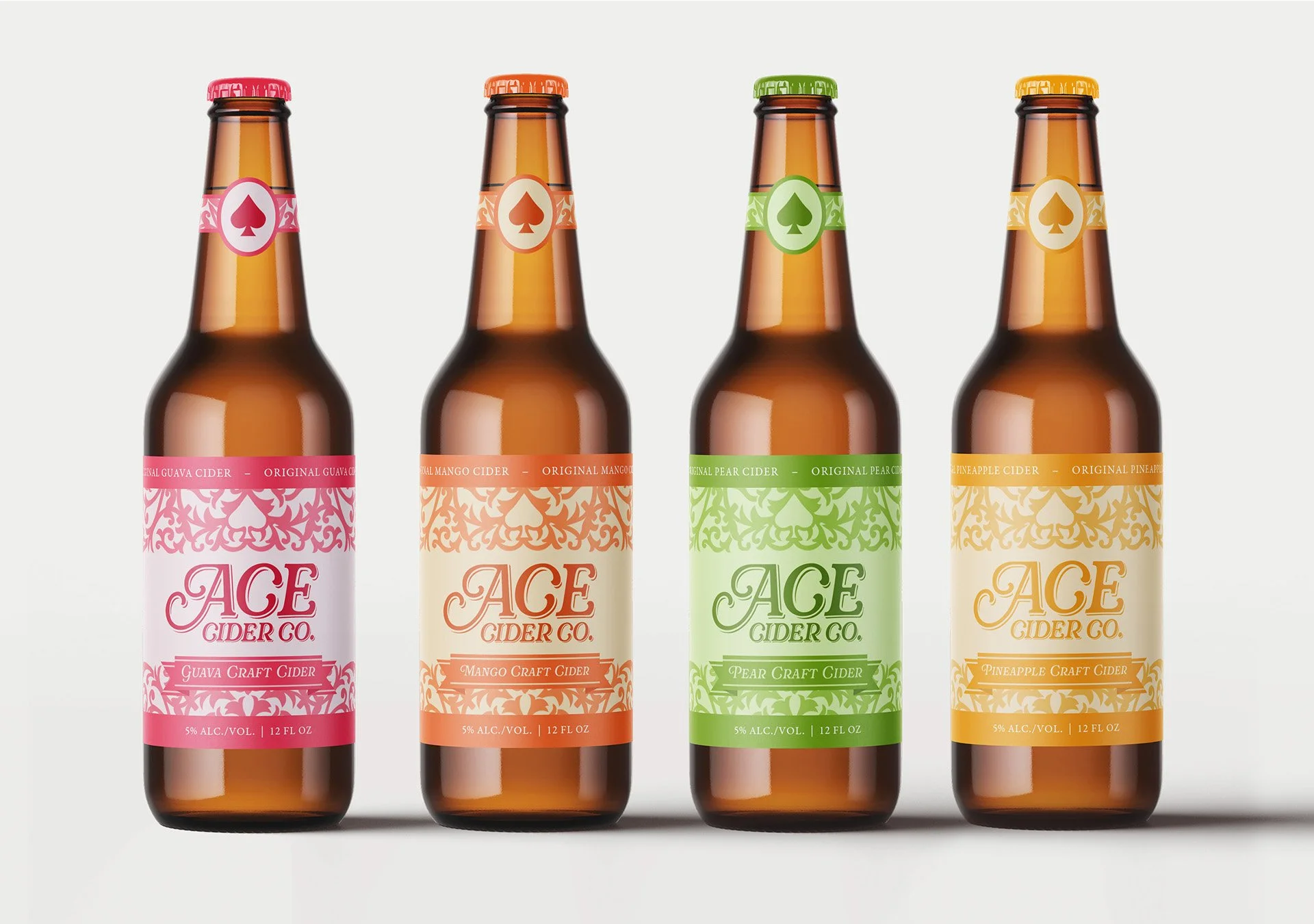
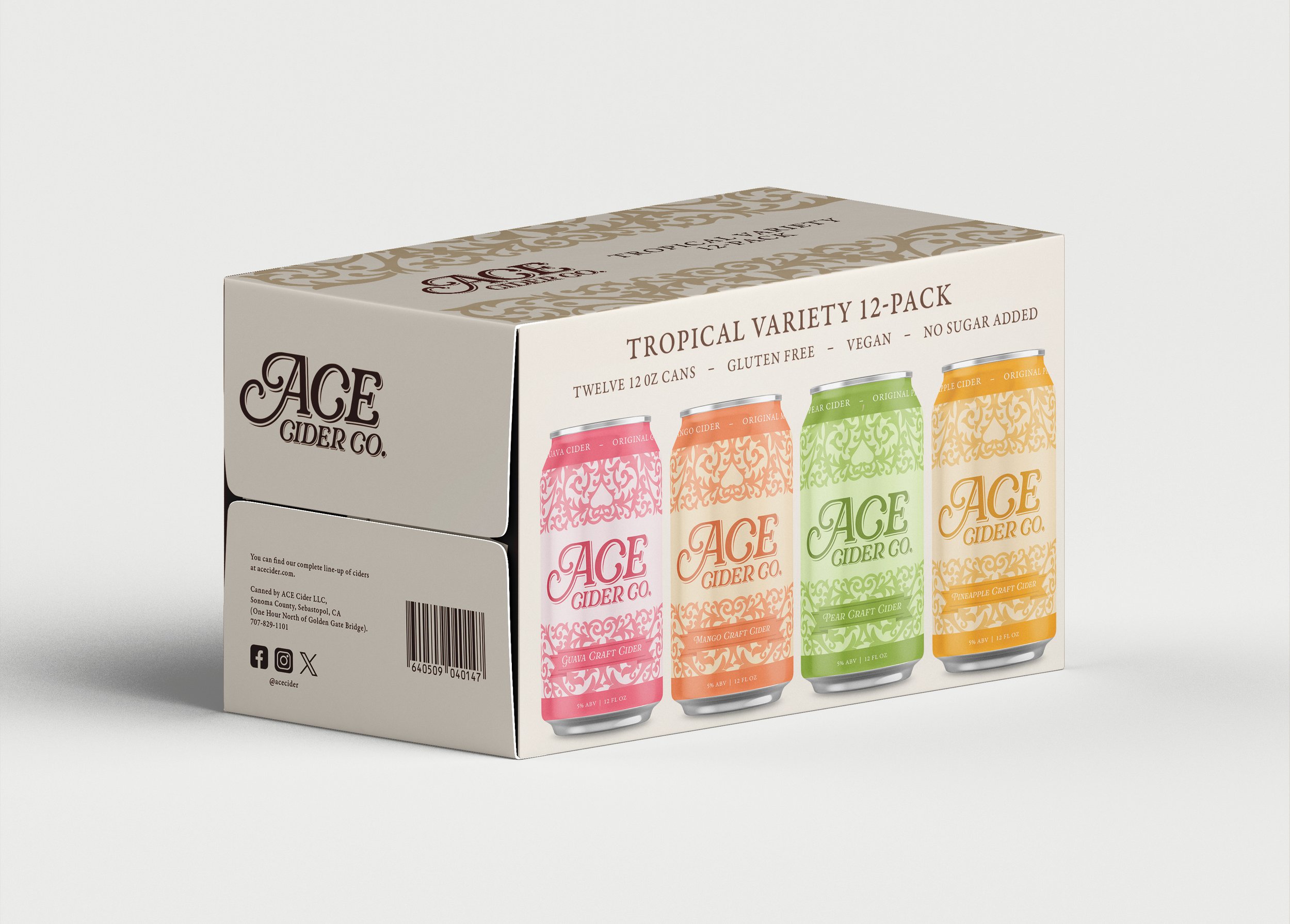
The redesign introduces a new logo, card-back inspired ornamental pattern, and refined spade motif that unify the brand across packaging and campaign applications. Structured hierarchy and bold flavor differentiation create clarity on shelf while reinforcing the craftsmanship and character behind the product.
A refreshed identity built for clarity, character, and stronger shelf impact

The Result
The resulting system gives ACE Cider a more cohesive, elevated presence on shelf
while remaining true to its heritage. The design balances refinement with familiarity,
strengthening visual impact and appealing to both loyal consumers and a new,
design-conscious audience.